


Icons
TLDR: Utopia uses a language for generating/naming icons/symbols. Most symbols, emoji, icons, flags, and logos are drawn from this language, sometimes with slight changes.
Prerequisites: Numbers
Emoji are great. If a picture is worth a thousand words, an icon is worth at least a few, and it seems to me like there’s a clear advantage to having an internationally-supported set of symbols that can be easily inserted into any text. 🎉
There are a few flaws in emoji, however.
For starters, emoji aren’t consistently rendered on different devices! This is not a case where letting the user render content in the way that works best for them is the right move. While in many cases the difference is minimal, sometimes the meaning or feel of the emoji change dramatically!


The pistol emoji is a particularly egregious case of meaning divergence, since texts written before the decision to use a water pistol are now retroactively-changed on most devices to use an image different from what the writer intended. In general I think it’s important for images to be faithfully represented in the way the artist/creator/sender intended, and I dock points from the emoji standard for failing to live up to that goal.
The next major source of weirdness in emoji are the inconsistencies in what’s supported and where it shows up in the list. Japan, having had such a strong and early influence on emoji, has its cultural fingerprints everywhere. There’s a Map of Japan: 🗾, which is so far the only country to have a map. A horde of emoji exist specifically for referencing Japanese stuff: 🎑 (Tsukimi), 🎎 (Hinamatsuri), 🎍 (Kadomatsu), 🎏 (Koinobori), 🎋 (Tanabata), 🌸 (Sakura), 👺 (Tengu), 👹 (Oni), 👘 (Kimono), ⛩️ (Torii), 🗻 (Mt. Fuji), 🗼 (Tokyo Tower), 🏩 (Love Hotel), 🏣 (Japanese Post Office), 🏯 (Japanese Castle), 🎐 (Japanese Wind Chime), ♨️ (Hot Springs), 🔰 (Shoshinsha Mark), 🚅 (Shinkansen; distinct from 🚄 (High-Speed Train) used for other countries), 🏮 (Izakaya), 🎴 (Hanafuda Card), 💹 (Yen-Increasing), 💱 (Yen-Dollar Currency Exchange), 💴 (Yen Banknotes), 📛 (Tulip Name-Badge), 🍣🍜🍙🍱🍲🍛🍘🍢🍡🍥🍧🍵🍶 (Japanese Food & Drink), 🈁🈂️🈷️🈶🈯🈹🈚🈸🈲🈳🈴🈺🈵🉐🉑㊗️㊙️ (Japanese Writing), 🇯🇵 (Japanese Flag), and 🎌 (Crossed Japanese Flags).
Meanwhile there’s no emoji for the Eiffel Tower, Christmas Wreath, Taj Mahal, Pharmacy Symbol (Green Plus), Red Plus, Chameleon, Lime, Computer Chip, or Virus. We have Right Arrow Curving Up/Down (⤴️ and ⤵️) but no Left Arrow Curving Up/Down. There are Large/Small Diamond emoji for Blue and Orange, but not for any other colors. And then of course there’s the constant battle for which flags to include, with, for example, Flag of Taiwan 🇹🇼 being banned on Chinese devices.
And of course, there’s the huge mess around skin tones and genders. As far back as 1993 an extremely abstract ☺ smiley was included in Unicode, which I think is pretty unobjectionable. But then in 1997 the first Japanese phones supporting proto-emoji were released that depicted more detailed humans:
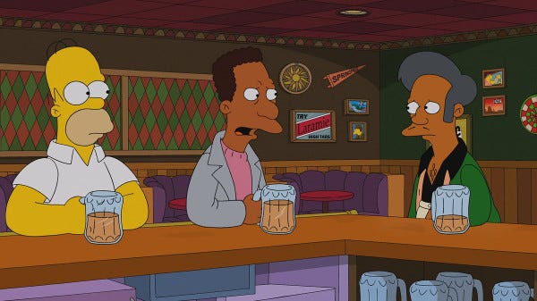
While the people in this original emoji set were only a few black and white pixels, they still carry notable race and gender features. Constrained as they were to niche Japanese phones, perhaps this is understandable, but as emoticons spread to other platforms and were more widely adopted, they continued to largely ignore questions of representation. Part of the problem was the emphasis on being abstract symbols meant that many had a hard time seeing the stereotypes or racial coding on emoji. “Simpson’s yellow” struck many light-skinned people as non-racially coded, calling back to smiley faces from the mid-20th century.
But these icons were always racially loaded. Consider, for example, that yellow on The Simpsons is very clearly a caucasian skin tone, in contrast with characters like Apu and Carl:
ZWJ Sequences
The awkward thing about all this is that there’s a pretty clean solution, and it’s one that already has a decent amount of support: allow multiple-symbols to fuse into a single icon. In unicode this is done with a zero-width-joiner (ZWJ) character. When two emoji are placed side-by-side with a ZWJ character in-between they sometimes combine into a new emoji.
For instance, 🏳 white flag + 🌈 rainbow = 🏳️🌈 rainbow flag.
(Side rant: Basically all emoji show up well on a white background. For instance, the white flag emoji seen above isn’t literally just white — it has an outline on most platforms. But the black flag emoji 🏴 doesn’t have a white outline (on most platforms) — it’s nearly invisible on a black background! Adding a soft white glow around emoji would make them render the same way in all contexts.)
The idea of combining symbols to make a single glyph is excellent! We can decide the gender of a character by ZWJ-ing a ♂️ or ♀️ at the end of another emoji, such as 🙅. And one can ZWJ a 🏽 symbol to decide skin tone: 🙅🏽♂️. There are modifiers that add beards or change an emoji-person’s hair. Combining different people can make “family” emoji with a specific composition. The possibilities are nearly endless.
Alas, things still suck in general. Even though many emoji support gender and skin tone modifiers, not all of them do. For instance, there’s no basic smiley-face that doesn’t have the yellow skin tone. And in the absence of a skin-tone, almost all platforms decide to render the default emoji as caucasian.
And outside of questions of race and gender, the support for ZWJ sequences is extremely lacking. For instance, it seems rather obvious to have modifier-symbols for colors, like skin tones, and allow them to apply to basic shapes such as circles, triangles, stars, et cetera. But no, just like the random assortment of non-combination emoji, there seems to be no rhyme or reason to the sparse few non-human ZWJ sequences currently recommended:
🐕 dog + 🦺 safety vest = 🐕🦺 service dog
🐈 cat + ⬛ black = 🐈⬛ black cat
🐻 bear + ❄️ snowflake = 🐻❄️ polar bear
👁️ eye + 🗨️ left speech bubble = 👁️🗨️ eye in speech bubble
❤️ red heart + 🔥 fire = ❤️🔥 heart on fire
❤️ red heart + 🩹 adhesive bandage = ❤️🩹 mending heart
and three flags (rainbow, transgender, and pirate).
That’s it! And if you don’t see the combination-emoji rendered as a single glyph, above, that’s more evidence that even these six symbols aren’t being handled.
It’s not hard. We should have more power.
Utopian Icons
I think in Utopia there’s a much better story for making symbols/icons/emoji/glyphs.
First, there’s a reasonably-large set of basic icons, each with a simple name. Unlike emoji, simple icons are designed with minimalism in mind. If color isn’t mentioned, the icon is the same color as the surrounding text. (And when color is mentioned, the icon is automatically given an outline so that it’s legible in any context.) Consistency of basic icons is a must, even across diverse platforms.
The names of basic icons often end with a set of sounds that indicates a number in (pseudo-)base 36. Thus almost all basic icons are found in groups, and the associated number can be seen as a parameter.
For instance, there might be a simple icon “koit” which is a solid square. A translation for “koit” might be something like “rectangle 18,” since the “soit” is the word for the number 18. There would then be a “kwop” icon for “rectangle 32,” “kit” for “rectangle 3,” and so on. Rectangles with a parameter less than 18 would be wider than they are tall, and those with a parameter greater than 18 would be taller than they are wide. Thus the user can draw boxes of a variety of shapes with a single syllable.
When two simple icons come into contact, they (by default) combine, with the second icon applying a transformation to the first. So, if “ʃoʃ” (“showsh”) means 5-pointed star, then “ʃoʃ” followed by “kwop” would be a 5-pointed star modified by a rectangle that’s taller than it is wide. What does it mean to be modified by a rectangle? Well, we could imagine that the k_ symbols change the aspect ratio of the preceding icon. Meaning “ʃoʃ kwop” would be a taller-than-wide 5-pointed star.
Want to make it a six-pointed star instead? Just swap out ʃoim for ʃoʃ! Want to make it a green star? Just add on another basic icon for the green hue. Want a darker shade of green? Add on the appropriate darkness symbol. By grouping icons, complex modifiers can be made from composites, such as applying a pattern instead of a solid color. Most complex icons simply overlay when juxtaposed.
Faces can be drawn by overlaying specific features like eyes, mouths, hair, and more. Letters are named after the series of simple icons used to make them. Flags, logos, and more are easily specified in the language of symbols.
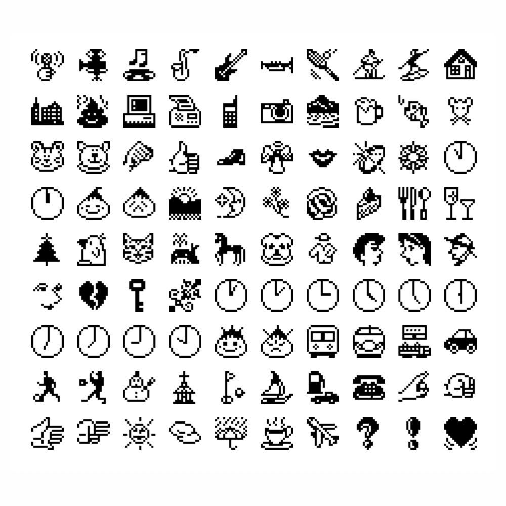
Here’s a high-level proposal for a starter list of simple icons. It’s by no means meant to be exhaustive. With time and support I would expect this list to be extended, especially as culture grows and changes. In the icon name, _ indicates a numerical suffix that can be referenced by X in the description. In cases where X isn’t indicated, a simple range of options is present depending on the number provided. When the modifier is absent the symbol simply overlays.
Name |              Icon               |           Modifier
s_   | Regular polygon with X corners  | X copies arranged circularly
ʃ_   | X pointed star (or heart)       | As with s_ but 1 more in center
h_   | Letter or digit
f_   | Human (face, hand, whole body)
fr_  | Misc. human body part
fʌs_ | Eyes
fɛh_ | Mouth
fair_| Hair
θ_   | Natural symbols (fire, mountain, cloud, mountain, snowflake)
k_   | Rectangle w/ aspect ratio 18:X  | Rescale to aspect ratio 18:X
kr_  | Parabola w/ vertex height X-18  | Warp according to parabola
g_   | Rightward arrow w/ shaft len. X | Translate right; crop overflow
gr_  | As g_ but with two arrowheads   | Translate right; rescale to fit
t_   | Disk with hue via X             | Set hue via X
tr_  | Disk with lightness via X       | Set lightness via X
tɛf_ | Human face w/ skin tone via X   | Set color to skin tone
d_   | Disk with saturation via X      | Set saturation via X
dr_  | Disk with X/36 opacity          | Set opacity to X/36%
p_   | Square w/ X vert. stripes       | Convert to outline
pr_  | Circular Gaussian cloud         | Add shadow w/ hardness via X
m_   | Disk sector w/ angle 10×X°      | Rotate 10×X°
mr_  | Right triangle w/ angle 2.5×X°  | Rotate 2.5×X°
n_   | Spiral with curvature via X     | Scale down to X/36
I claim that with just this basic list one could straightforwardly recreate symbols like 🛑, 😛, ≈, 💢, 💤, 🕟, 💜, 🤛, 💧, 🔍, 🔒, 🚫, ☯, ÷, 🔹, and 🇫🇷. Or at least, the versions that don’t have arbitrary shading and/or gradients could be recreated. And while it would be difficult to reconstruct arbitrarily detailed pictures of animals, or whatever, I think with only a few more extensions to the symbol/modifier set one could easily create recognizable icons for snakes, dragons, trains, and fax machines.
In Utopia, we can see, the emoji-equivalent are more obviously constructed by the user, rather than chosen from a menu. Users will probably have shortcuts that let them easily re-create favorite icons, rather than having to spell them out, but in general the canvas is wide open for design by combining powerful primitives.
The vocabulary of simple icons along with the rules for how they combine, overlay, and juxtapose essentially forms a language with which simple pictures can easily be crafted. More complex than emoji, but simpler than data formats like SVG, Utopian icon language hits a sweet spot for expression that our world simply lacks.
🚀