


Maps and Addresses
TLDR: There are much better choices for map projections than Mercator, especially if you allow many interruptions, like the Butterfly or myriahedral. East should be up. Coordinate-based addressing is good, but latitude should be replaced by distance. The best “world map” is an atlas.
Prerequisites: It’ll be helpful to have read Numbers and the first part of Spacetime Distances. The Onion Test for Scientific Explanations is also relevant. Nothing is strictly necessary.
“A map of the world that does not include Utopia is not worth even glancing at, for it leaves out the one country at which Humanity is always landing. And when Humanity lands there, it looks out, and, seeing a better country, sets sail. Progress is the realisation of Utopias.”
― Oscar Wilde, The Soul of Man Under Socialism (1891)

Curved surfaces like spheres or the Earth can't be accurately described by a flat map. All maps of the Earth are forced to distort their subject matter in some way, but some distortions are better than others, depending on how you're using the map. The Mercator distortion is garbage for comparing sizes, the Gall-Peters distortion is garbage for understanding shapes, and even the Waterman Butterfly distorts space slightly near the edges of the segments, such as around Pakistan:

Even local maps are distorted, though it becomes less and less of an issue at smaller scales, when the curvature of the Earth isn't particularly noticeable. It seems like a worth-while custom to include information about which distortion a map uses, alongside the date that the map was made.
North Isn't Up
I'm glad our world has settled on a standard orientation for maps. North being normally at the top of the map means anyone can orient to a map just by seeing how the words are oriented.
Unfortunately, we chose the wrong standard.
The top of the average map should be east, like it used to be.
, Iafeth (Japheth) and Cham (Ham).")
Imagine being a stationary god looking down on the Earth from space. The Earth is spinning under you, with the east retreating and the west arriving. Imagine there are words printed on it (for the moment consider the words being from a book). What word-orientation would be most convenient? Words are read left-to-right and top-to-bottom,1 so it would be nice if the Earth naturally rotated with the reading direction. This would put either south or east at the top. But south-up is a bit annoying because it's not clear how long each line of text should be, and you'll have way more words being half-visible or hard to read due to the curvature.
To orient literally means “to face east,” and how fitting it is to have the place where the day begins be where the eye begins to read. The sun rises in the east, and it seems fitting that the east should therefore be the part of the map that rises over the rest. When looking down on a globe it's convenient not to have a pole in the way (hence part of why most globes are tilted). Because the poles are inhospitable, long journeys are most commonly east-west, which (half of the time) matches how one faces when orienting with an east-up map. Last (and least) it'd be kinda nice if world maps put the most populous place/biggest continent (Asia) in a prominent position.
Truly, this seems overdetermined.2
Coordinates
What's your current latitude and longitude?
Most readers, I suspect, won't have a good answer. Even those with enough knowledge to guess at a rough number probably don't know their position with any real precision.
This seems a bit silly. It's not like it's unimportant to communicate precisely about where we, and other things, are! But instead of just saying plainly where something/someone is, we use a bizarre collection of local schema involving cities, streets, blocks, and postal codes, which are inconsistent between countries and don't even allow for talking about arbitrary locations.
Things didn't have to be this way. Imagine if all addresses were coordinates (as they effectively are in some places). You'd be able to easily navigate to an arbitrary destination without a map! Extremely convenient.
But latitudes and longitudes kinda suck.
First of all, they seem comparable, but are decidedly different indicators. If someone is at 43° latitude they're somewhere in a ring, centered on the North Pole. If someone is 43° longitude they're somewhere in a wedge, with tips at the poles, and centered on the west coast of Somalia near Jamame. There are 360 degrees of longitude, but only 180 degrees of latitude. Due to the fact that Earth isn’t perfectly spherical, one degree of latitude change does vary ever-so-slightly by location, but is consistently about 111 km, but moving a degree of longitude means very different things depending on how close you are to the poles.

Another problem with using latitudes and longitudes is their bulk. Consider the common use-case of indicating a postal address. I randomly looked up two townhouses in Manchester. Their longitudes were essentially identical, and their latitudes were very similar: 53.446635 versus 53.446603. Almost all of this information is saying that they’re in (the latitude of) Manchester, which is practically useless for locating the particular address. This problem becomes worse when also considering the longitude, which may or may not change along a given street.
Numbers like these are thoroughly unmemorable. Humans are excellent at remembering words, and can pack in far more information with a lexical index. It's this feature that's led to clever technologies like what3words, which would be great… except that involves dropping the ability to use addresses to navigate and reason about the world — an extremely useful feature!
Using numerical coordinates to refer to places on Earth seems good, but I claim that a more ideal system would discard latitude and simply count distance to the North Pole in kilometers, rather than angular distance from the equator. This would help highlight how it’s a different kind of beast than longitude.
Longitude is mostly okay. I think it should probably go from 0° to 360° instead of -180° to +180°, and if east is up, then it seems better for it to increase as it goes westward, rather than decrease, like it currently does, but these are nitpicks. It’s a bit of an accident3 that the antimeridian happens to be on the opposite side of the Earth to London, but I think it’s well positioned — the middle of the Pacific Ocean, being so empty from a human perspective, is the natural place to cut a map or start measuring from. I do think that it would be neat if we used hues to represent longitude, since humans naturally understand that color goes in a wheel. We could then reference a place with something like “5483 vivid-indigo4 kilometers,” rather than by using a pair of angles.
Utopian Addresses
The Utopian writing/number system, there’s a correspondence between small numbers and basic consonants:
0 = n/ng
1 = m
2 = k/g
3 = t/d
4 = p/b
5 = f/v/th
Using this correspondence, we can map two-syllable words into numbers from 0 to 215, by treating the consonants as digits in little-endian base-six.
 # | Utopian | Digits | English
----------------------------------
 0 | naunung |  0,0,0 | value
 1 |  mining |  1,0,0 | curiosity
 2 |  kanung |  2,0,0 | learn
 3 |  tinung |  3,0,0 | soul
 4 | paunaun |  4,0,0 | hint
 5 |  funung |  5,0,0 | culture
 6 |  neimin |  0,1,0 | yearning
 7 |   mamin |  1,1,0 | improve
 8 |  kimine |  2,1,0 | awaken
 9 |  tumine |  3,1,0 | inventor
10 |  pimine |  4,1,0 | newborn
11 | feimine |  5,1,0 | fusion
12 |   nikan |  0,2,0 | optimal
...
We could pack more information into our choice of words, such as by using vowels, additional consonants, or the structures of the words, but with just 216 options we can prioritize sensible words that sound reasonably different, which is helpful when communicating. (Imagine trying to distinguish what3words’ “///spin.lawyer.bath” vs “///spin.lawyer.path” over a radio or in a noisy pub.)
Small patches of Earth’s surface are very close to flat, and so for regional navigation it is most natural to reference the locations of things by reference to something like a Cartesian grid, approximately aligned with the cardinal directions. Ideally, within a given local area, addresses would be a pair of natural numbers, without needing negative or fractional values. Using the Utopian units of distance, we can say that a stretch (≈ 117 cm ≈ 46 inches) is too fine-grained for most purposes, while a tower (≈ 42 m ≈ 140 feet) is going to be too course for dense, urban places. The geometric mean, 6 stretches or 1/6 towers (≈ 7 m ≈ 23 feet), is just right.
216 of these units is exactly one Utopian mile (≈ 1.52 km), so while we could theoretically use a pair of words as an address, it would only work in the context of a neighborhood. If we instead use two words for east-west and two words for north-south, we can uniquely identify addresses within a province that’s about 329 km on each side — big enough to uniquely identify them with reasonable-length names. By using the province name in between the number-words, we can unambiguously locate any place on Earth in less than a dozen syllables.
For example, suppose there’s a province named “Olguin.” We can indicate an address there by saying:
tigab fikuk Olguin nikud pauneim
This looks like a pile of nonsense sounds, of course, since we don’t speak Utopian. But to someone for whom those are words, it might read something like:
Red net, Olguin, Crying motive.
Very memorable! It’s at least easy to say and memorize when compared to the latitude+longitude of “20.747797, -76.029233” or the plus code of “PXXC+387 Báguano, Cuba.” It also compares reasonably well to traditional address like “Union Street #7941, Báguano, Cuba” or a what3words like “///digesting.rookies.clicker.” And unlike those systems, it serves as a coordinate system that can be used for navigation and doesn’t require a database to use (except to know where Olguin is5):
tigab fikuk | nikud pauneim  (words)
t,g,b,f,k,k | n,k,d,p,n,m    (letters)
3,2,4,5,2,2 | 0,2,3,4,0,1    (heximal digits)
      19383 | 8760           (decimal numbers)
 136.534 km | 61.705 km      (distances)
Once they learn the system, Utopians can use this property of addresses to easily find places they’ve never been before (without the aid of machines).
Of course, not everything we want to reference when navigating will have an address. Towns, neighborhoods, mountains, and rivers get names like they do in our world, but what about roads? It seems right to me to give names to major roads for the sake of navigation. If all cities had roads set up in a grid, I’d suggest naming the roads after the shared part of the addresses they connect, plus some indicator of whether they’re north-south or east-west, but most roads aren’t so perfectly aligned (even in Utopia), and in the absence of that, I think it makes sense to fall back on monikers like “main street” and “broadway.”6
But it also seems unnecessary to give arbitrary names to all minor roads. At intersections, I think the Utopian norm is to see signs indicating the (numerical) address for that intersection, along with arrows pointing in the cardinal directions.7 Together, these bits of information are sufficient to help travelers navigate to their destinations.
One detail still remains: how, exactly, do we form a “grid” given that the Earth isn’t actually flat. On the small scale of a province it might not matter very much, but the principle still matters. My guess is that Utopia defaults to azimuthal equidistant projections (AEQD), just as our world does, for regional maps. Since addresses are based on distances, it seems better to use a projection that preserves distances (rather than something like areas), and AEQD has the advantage of being symmetric in its distortions, not requiring any arbitrary choices of reference points (beyond the center point of the province), and works nicely even when near the poles.

Provinces can overlap. These are geographic areas, not necessarily cultural/political units, and it seems fine to have neighboring countries (e.g. Belgium and Luxembourg) use different addresses even if they could theoretically share.
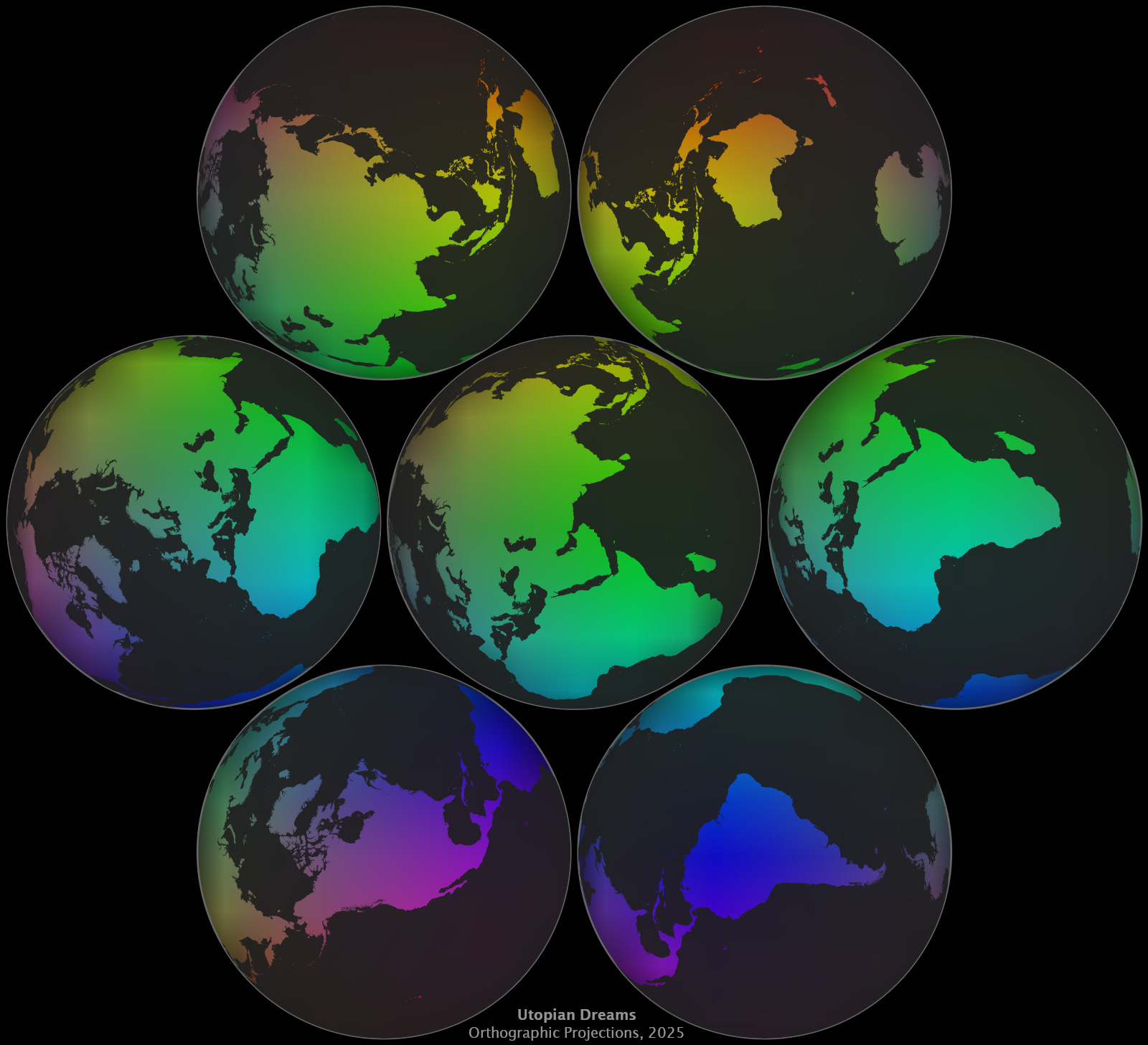
Myriahedral World Maps
While an AEQD projection works fine for a local region, it’s a bad choice when mapping the entire world.

The Waterman Butterfly looks much better for visualizing the whole world. Why? What makes it so good? I claim that it’s the interruptions — the sections of map where there’s a cut.
In a sense, the Butterfly is a bit like eight sub-maps stitched together. Because each sub-map is of a smaller region, the distortions from the projection are less egregious. Indeed, in the limit of infinite cuts, a map can be “perfectly conformal” and “perfectly area-preserving” — supposed limitations disappear! Except of course, that a map with that many cuts becomes confetti dust, and is basically useless. But the point remains that interruptions are under-explored, and can make maps nice. As we increase the number of cuts from just cutting along the antimeridian to cutting all over the place, we move from the realm of polyhedral projection to myriahedral projection.

Unless you happen to need to use the map for navigating,8 the primary downside to myriahedral projection is that it tends to put cuts in places we care about, such as in the middle of your home country. We could render each country separately, but then by default we’d lose all sense of borders and where countries are in relation to each other. The trick is to include redundancy — a Utopian myriahedral projection should have a low-distortion view on every place, but some places might be viewed multiple times. Once we have these two principles in hand: myriahedral interruptions and redundancy, we can find our way to a truly Utopian world map — a small atlas of local views, which together have the added benefit of conveying the shape of Earth:
Sorry, Arabic, Hebrew, Farsi, Urdu, and others, but your writing system is backwards! About 90% of people are right-handed, and right-to-left writing smudges easily when writing with the right hand. Utopian writing goes left-to-right.
One additional point in favor of east-up is that latitude is clearly the first number and longitude is the second number. When we give coordinates in other systems, the first number is usually rendered horizontally and the second number is vertical.
It’s not entirely an accident that a very important place is on the opposite side of the Earth as the least-populated place, since population is correlated with importance. But still.
One obnoxious thing about using colors is that they’re quite imprecise, especially when using names rather than numbers. For example, as far as I can tell, our civilization doesn’t even have unique names for the hues up to the granularity of degrees (i.e. 360 different color names). But I see this as more of an issue with our civilization than with using colors to indicate direction in polar coordinates.
We could, of course, indicate province location using latitude+longitude (or with distance+color), but we’d also technically need to specify a geodetic datum, so trying to be clever and just use coordinates is probably unwise. In most contexts people know where relevant provinces are, so I think referencing them by name is ideal for most cases.
The word “road” is not technically synonymous with “street” — a road is a large, constructed path joining two or more places, where a street is a kind of urban road that features homes and/or businesses along its length. I expect that when Utopia names roads, it consistently uses words that either distinguish them as highways (for going fast), streets (urban slow), or parkways (rural slow).
Instead of simple designs that indicate direction with words/symbols, my guess is that Utopian direction signs have (in addition to words/symbols) a long, bold arrow pointing south and a shorter, angular arrow pointing west. This is because, if you’re oriented to the east, the primary axis is horizontal and goes from north to south, while the secondary axis on the vertical goes east to west. Signs with this design have the advantage of being able to be read from any direction (as opposed to a sign that just pointed one way, for instance) and not requiring any symbolic reasoning to use.
The infamous Mercator projection is pretty useful if you’re a 16th century sailor! But in these modern times, navigation is usually done by machine and can involve building a map on the fly, specialized for the route. Google Maps’ decision to use the Mercator projection is still baffling. If I was in charge, I'd have Google maps use a perspective-based projection where the “camera” is set at a height based on the zoom level, ie a general perspective projection (like Google Earth uses).
Oh no I've been called out by xkcd 😭
https://xkcd.com/3122/
Another cool thing I dug up when researching this topic, but couldn't find a place to squeeze it in is a cool exploration of the Valeriepieris circle (aka "a majority of humans live in this circle"). The original "circle" is only a circle on a Winkel tripel projection, and so there are some neat alternatives that better reflect the globe's geometry: https://www.statsmapsnpix.com/2022/02/the-yuxi-circle.html